Technical Web Producer | UI Systems Case Study
Figma, Responsive Systems, Design System Architecture, Interactive Prototyping

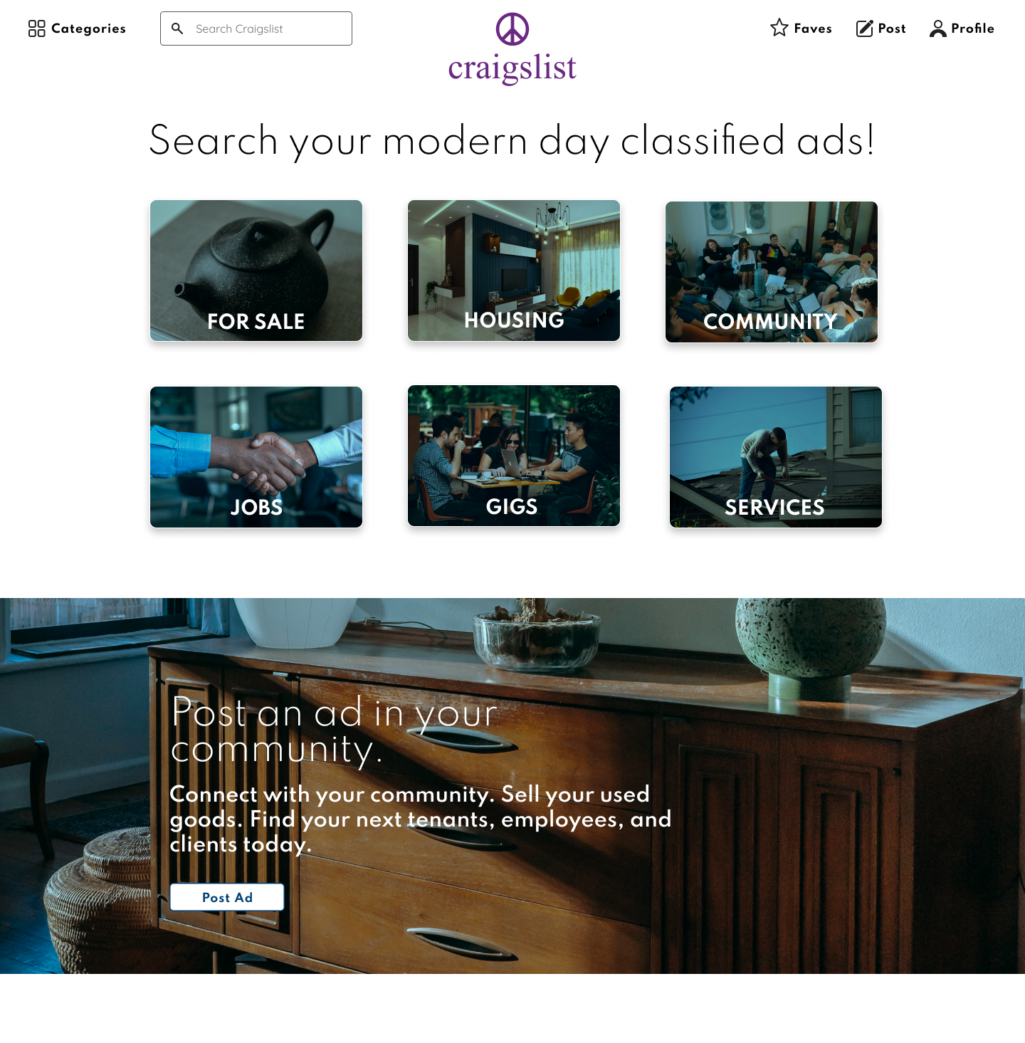
Craigslist remains one of the most recognized classified listing platforms, known for its functional simplicity but minimal visual hierarchy.
Goal: Simplify high-density information and reduce cognitive load while preserving the platform’s core utility.
Technical Focus: Re-architecting legacy workflows into a responsive, mobile-first system with structured visual hierarchy and consistent interaction patterns.
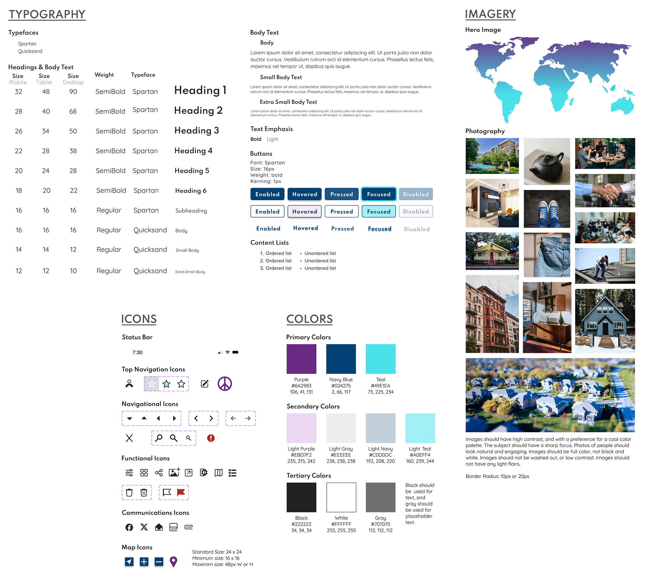
To modernize a data-heavy interface, I developed a structured design system to ensure visual consistency and responsive stability across redesigned screens.
Typography & Hierarchy: Introduced a defined title and body type system to improve readability and scanning.
Reusable Components: Built a centralized library of icons, cards, filters, and UI patterns to support consistency.
Responsive Structure: Defined layout behavior across mobile, tablet, and desktop breakpoints.
The system translated structural decisions into repeatable interface patterns, ensuring long-term consistency across complex listing types.
Click here to view the entire design system on Figma.
The legacy interface presents dense text layouts with limited hierarchy, increasing cognitive effort during search and listing workflows.
I focused on three primary structural modules:
Account Management: Simplified saved listings and location management.
Advanced Search: Modernized filtering for high-density housing and marketplace browsing.
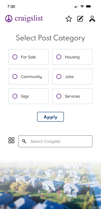
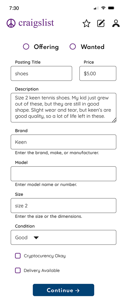
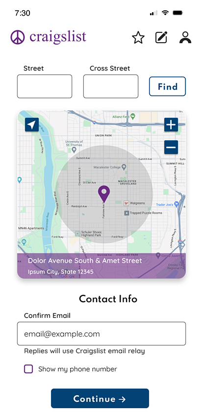
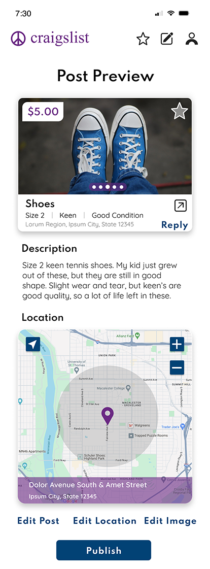
Posting Flow: Reduced friction in the listing creation process for repeat users.
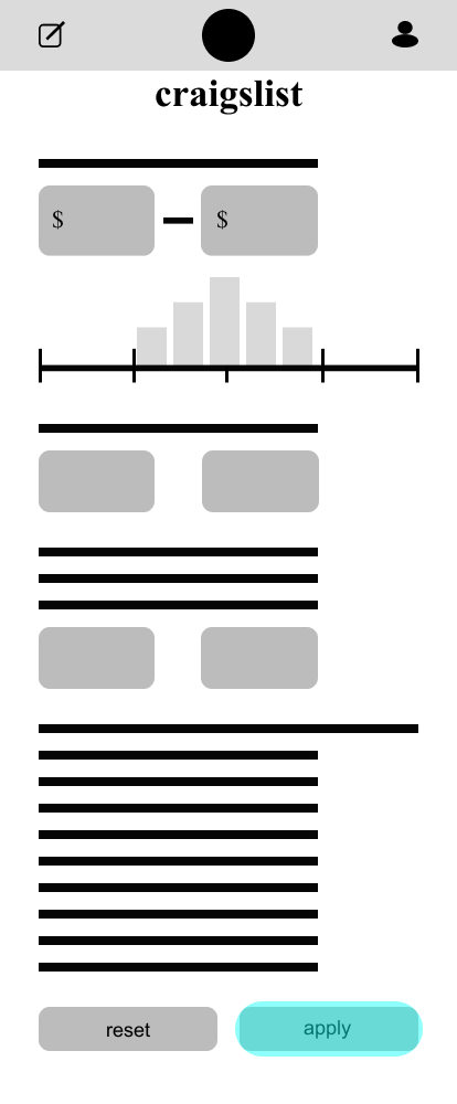
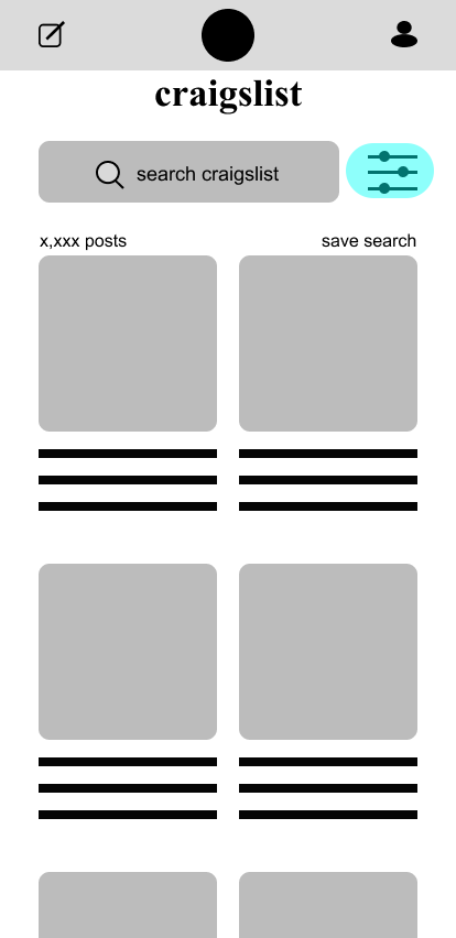
In response, I focused on reducing cognitive load through clearer hierarchy, structured filtering patterns, and modular card layouts designed for scalable implementation.
I analyzed existing flows and mapped friction points before restructuring the information architecture.
These wireframes were not aesthetic exercises, but structural tests. Each iteration refined navigation flow, filter clarity, and content grouping before visual styling was introduced.
Using a mobile-first approach, I progressed from low-fidelity sketches to mid-fidelity wireframes to validate layout hierarchy and module relationships before visual refinement.
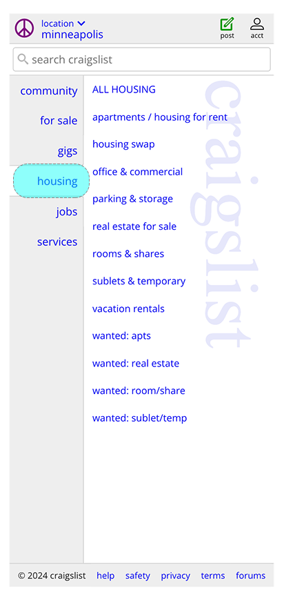
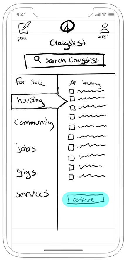
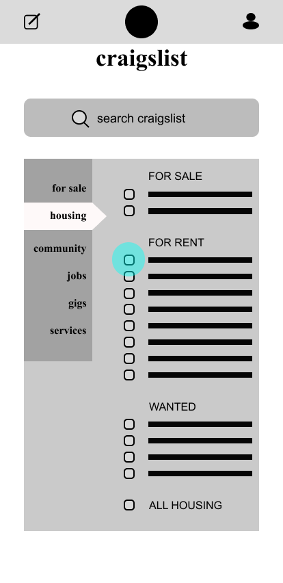
Craigslist Original Search Screens
Low Fidelity Search Screens
Click here to view the entire set of low fidelity wireframes onFigma.
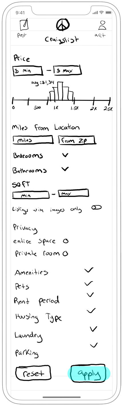
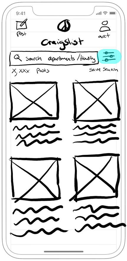
Mid Fidelity Search Screens
Click here to view the entire set of mid fidelity wireframes on Figma.
Validated wireframes were translated into high-fidelity mockups focused on spacing systems, structured hierarchy, and component consistency.
• Refined card layouts to reduce visual noise.
• Standardized filter behavior for clarity and predictability.
• Defined responsive adaptations across device sizes.
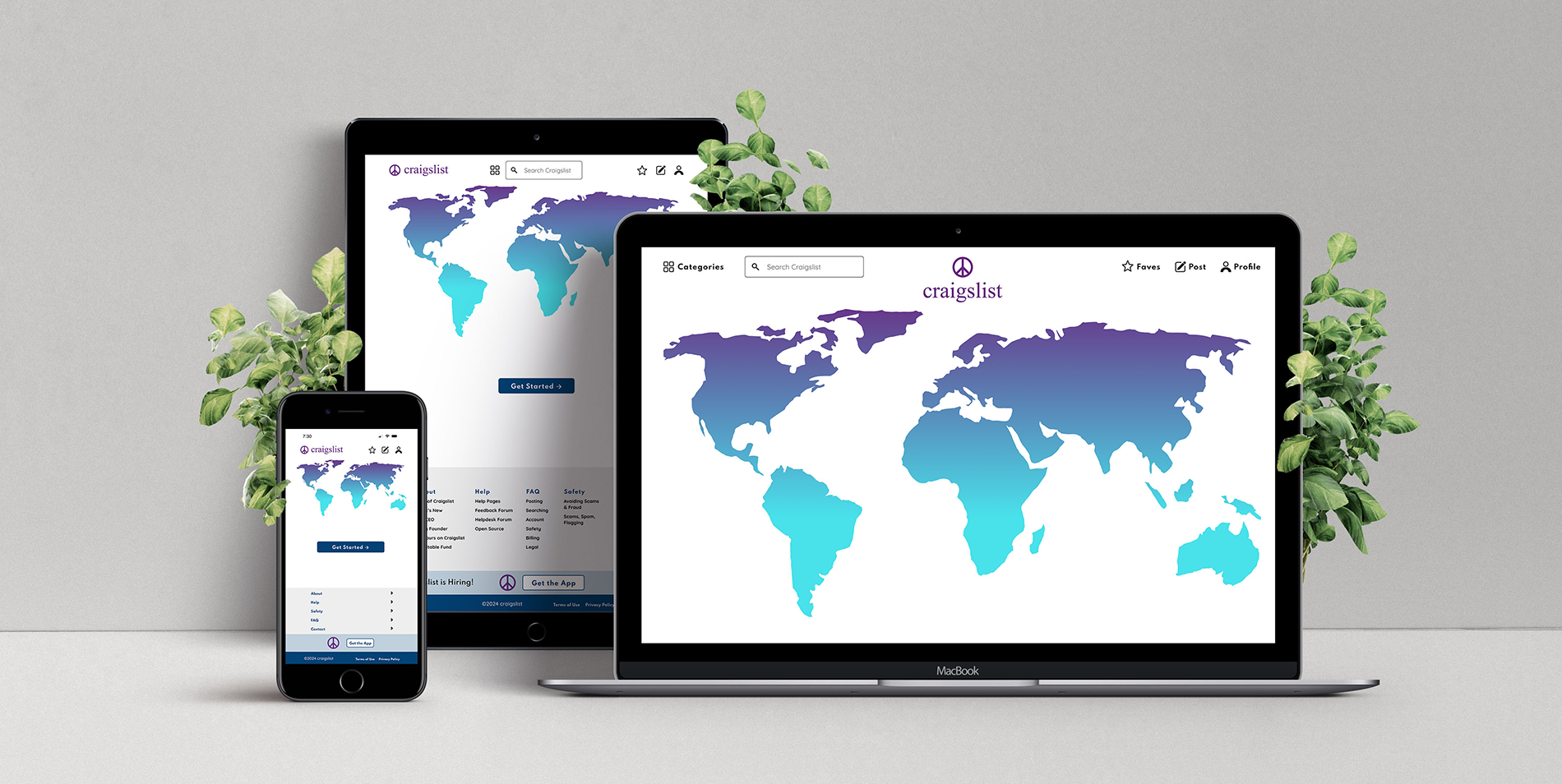
Responsive & Mobile Design Mockups


Click here to view the entire set of high fidelity mobile and responsive mockups on Figma.
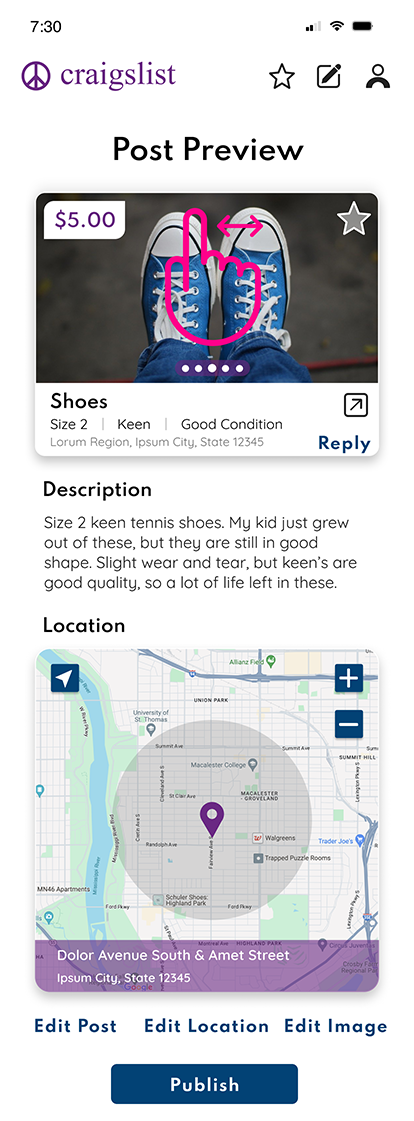
Interactive behaviors and modal transitions were documented to communicate technical intent for implementation.
• Defined modal open/close transitions.
• Clarified interaction states for filters and listings.
Gestures
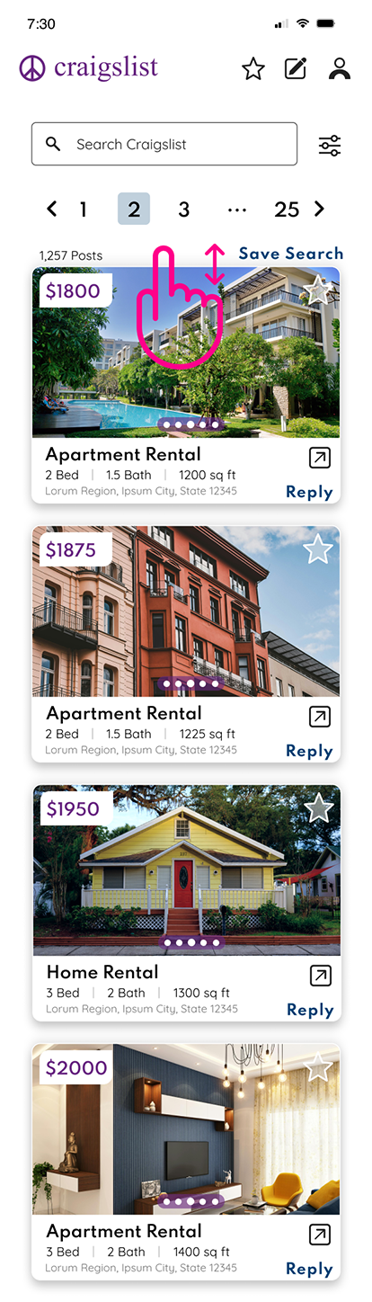
The redesign shifts from text-dense listing pages to a structured card-based layout with improved spacing and clearer filter hierarchy.
The comparison demonstrates:
• Improved scan-ability
• Clearer category separation
• More structured visual rhythm
Before
After

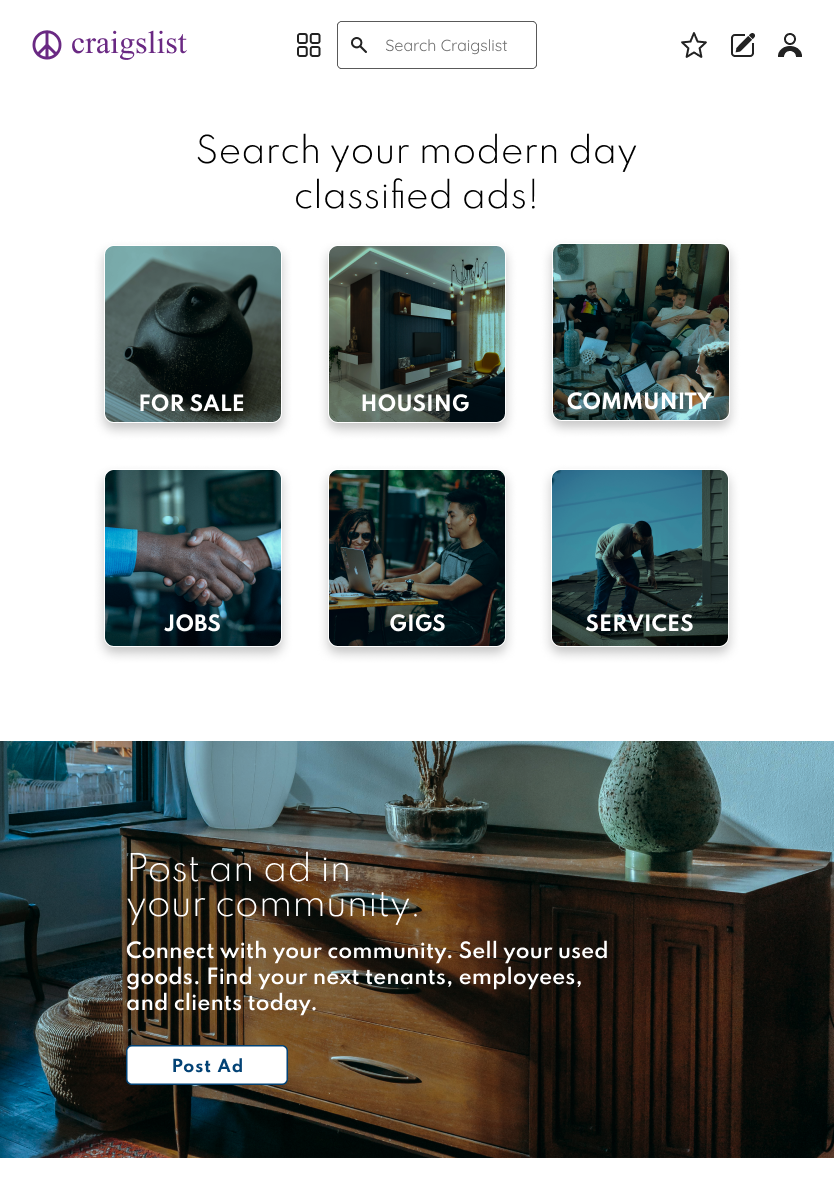
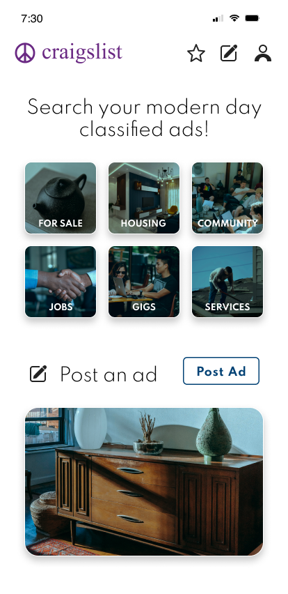
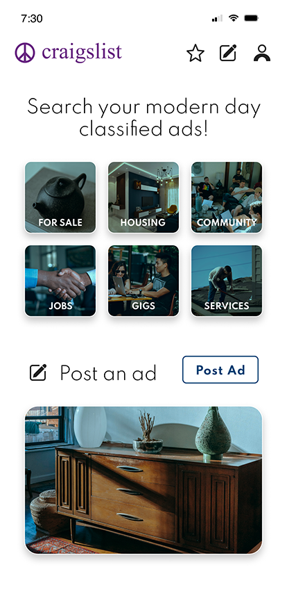
Craigslist's original home page and my redesigned home page.
Before
After
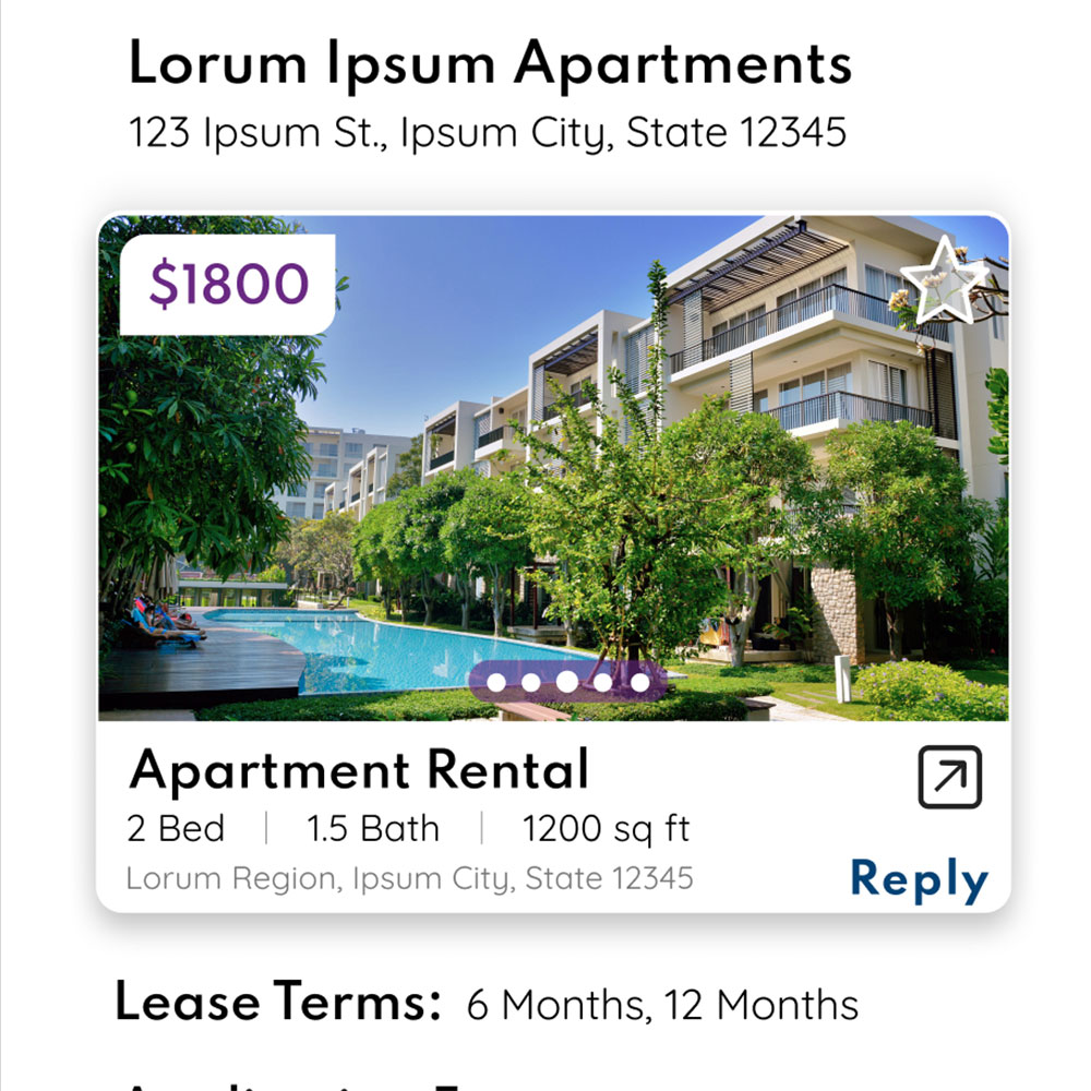
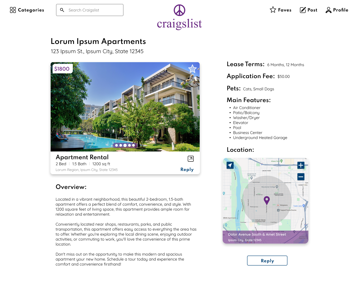
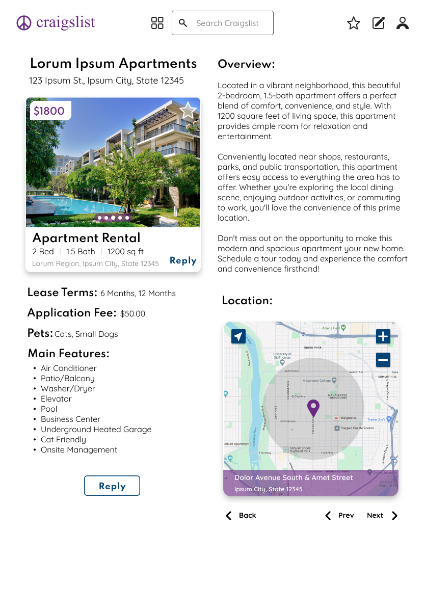
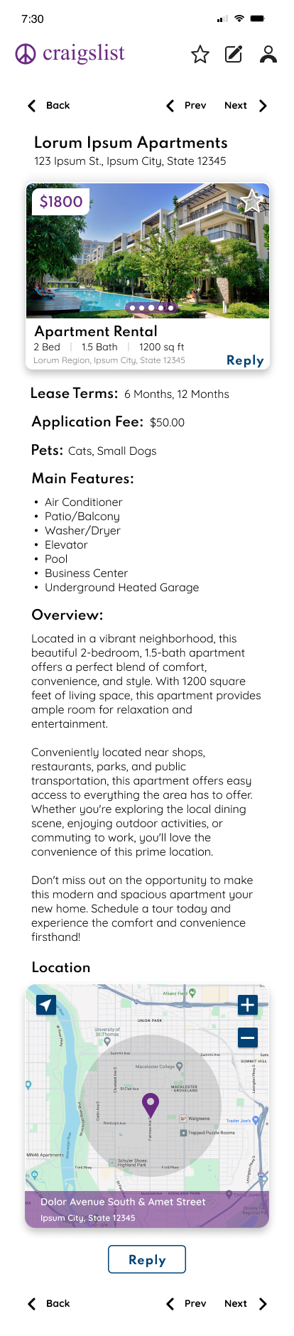
Craigslist's design of an apartment listing where the user is able to view multiple photos by clicking on the smaller images under the large one, compared to my redesigned version of a card where multiple photos can be viewed by navigating through them with a swipe gesture.
Before
After
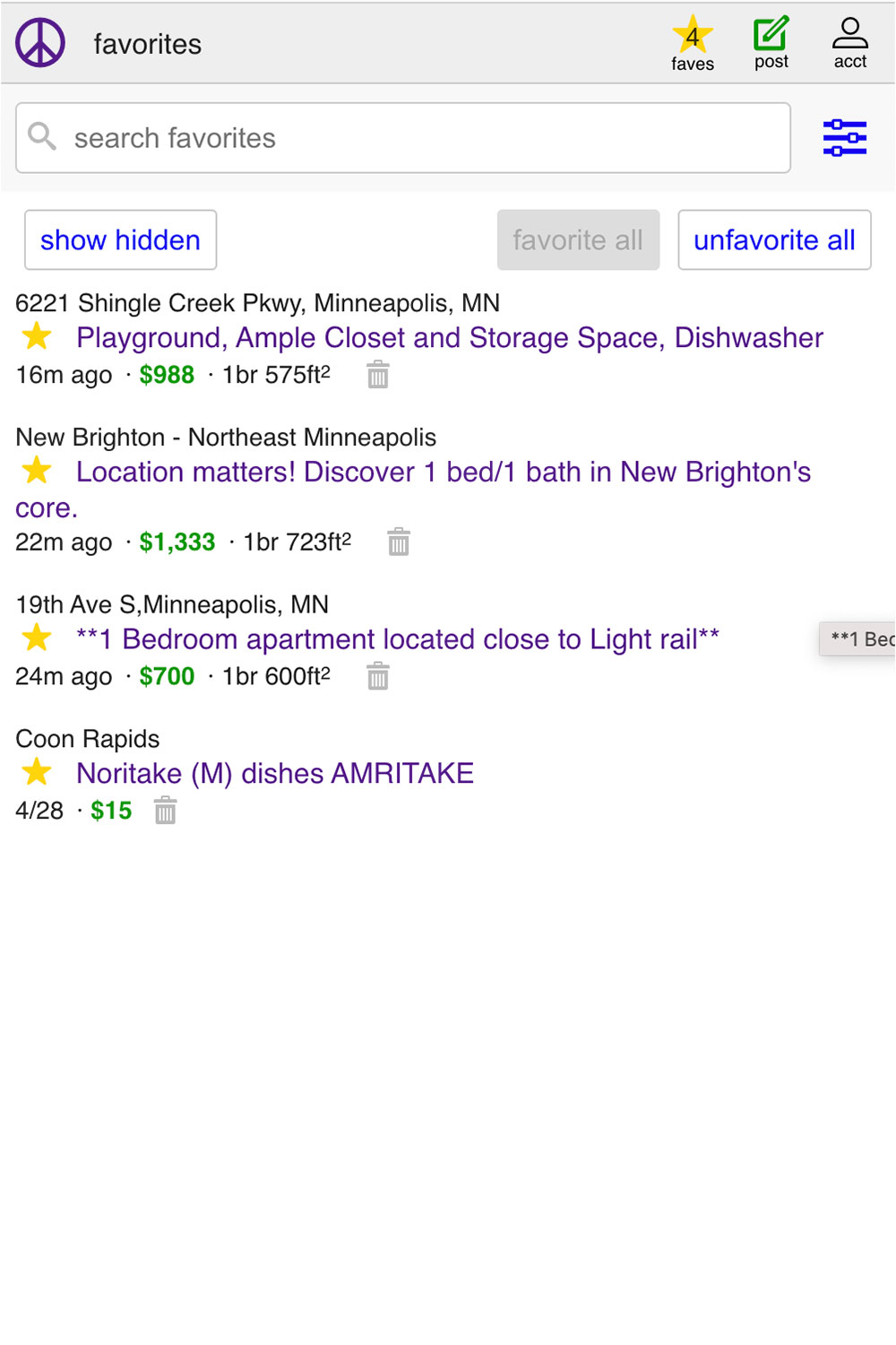
Craigslist's original design of their saved favorite items, next to my redesign of this feature. I created both a more visually appealing, and easier to read screen.
Before
After
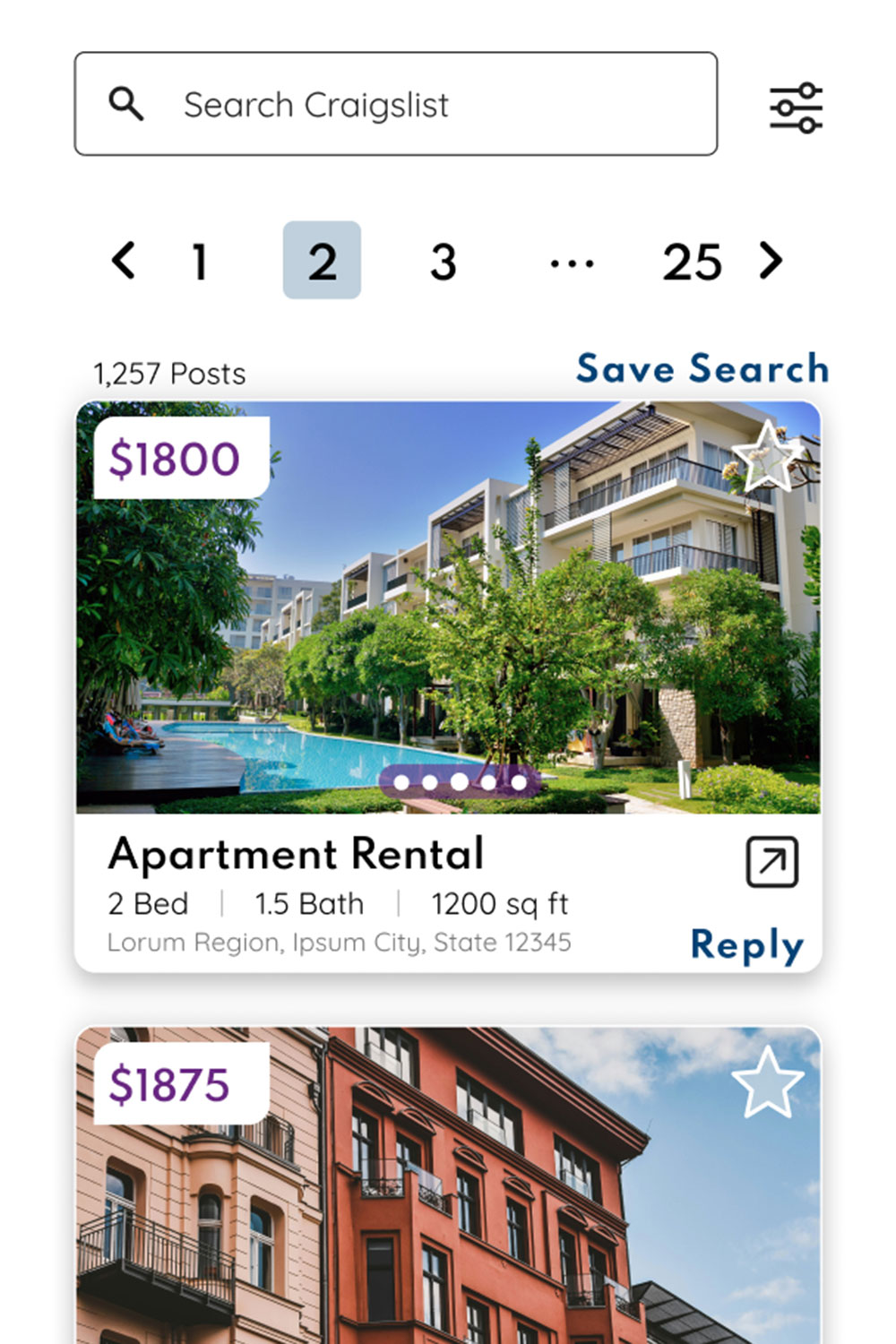
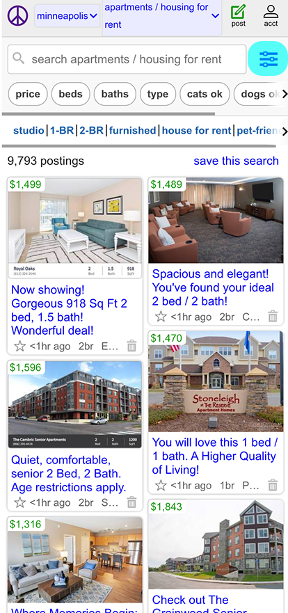
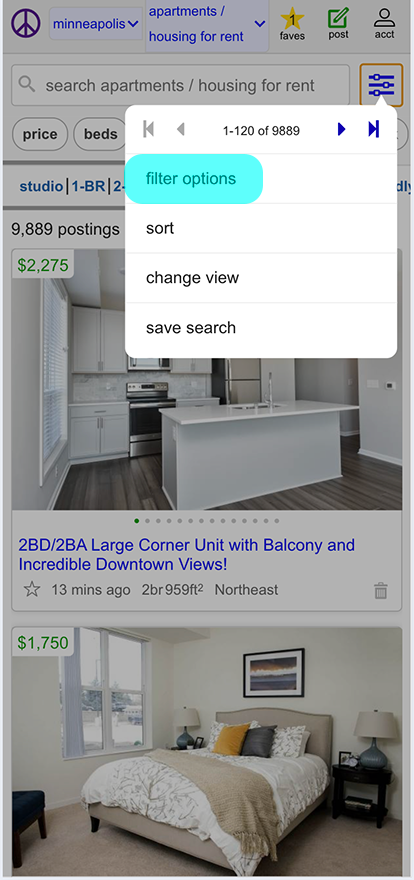
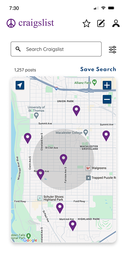
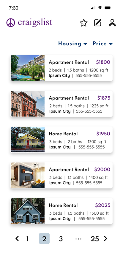
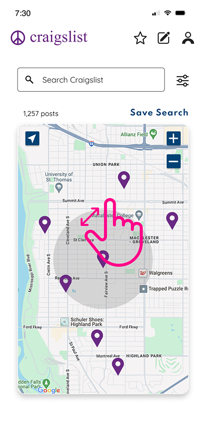
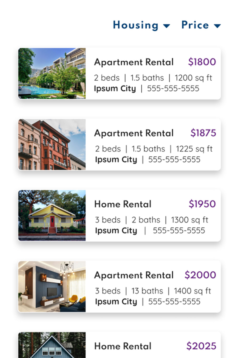
Craigslist's original listing of searched apartments, versus my redesign. I decided to remove the row of button selections across the top, and instead contain all this information in the filter button on the upper right hand corner. I also added the ability to scroll through photos for each listing, favorite listings, and pagination navigation.
Click on each user flow to interact with the prototypes:
Sign Up

Search
Post
Impact: This project demonstrates how a structured design system can modernize high-density information environments while preserving functional familiarity.
By re-architecting layout hierarchy and interaction flows, the redesign reduces visual friction without compromising platform utility.
Future Roadmap: Future iterations would include structured usability validation of search filter behavior and further refinement of responsive patterns across global listing variations.