Technical Web Producer & UI Lead
Figma, Component Systems, Responsive Layout Architecture, Interaction Logic, Developer-Ready Documentation
Redo Guru is a complex web application designed to support real-time video and text consultation between homeowners and industry experts.
Goal: Architect a scalable, responsive interface that preserves visual hierarchy and usability across mobile and desktop environments.
Execution Focus: Translated complex interaction logic into a structured, component-based design system.
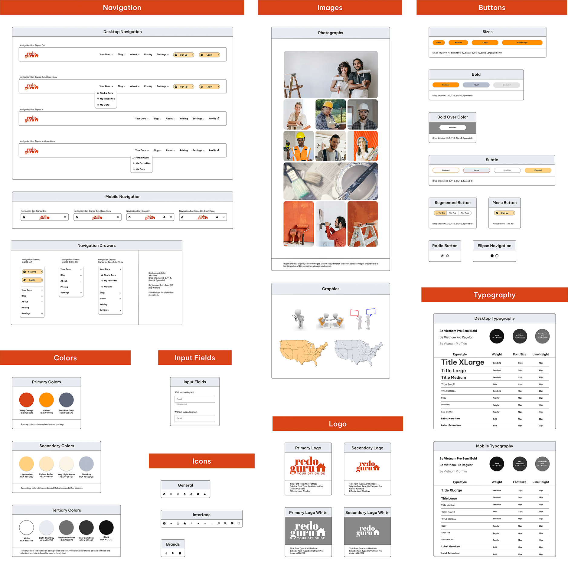
To ensure long-term consistency and implementation readiness, I developed a structured component library and style guide. The system established clear layout patterns, spacing rules, and responsive behavior to support scalable growth across mobile and desktop interfaces.
• 8pt Grid System: Applied to maintain precise spacing, rhythm, and structural alignment across breakpoints.
• Reusable Components: Built modular UI elements to support rapid iteration and long-term maintainability.
• Accessibility Considerations: Incorporated contrast standards and typographic hierarchy to support legibility and inclusive design.
Before moving to implementation, I validated the product logic through a targeted user survey (21 respondents) and in-depth interviews. This research ensured the technical requirements of the app were grounded in real-world user needs.
• Key Insight: Homeowners struggle with conflicting online advice and hit technical roadblocks that require real-time expertise.
• The Solution: An expert-on-demand marketplace designed to minimize research fatigue and maximize project completion rates.
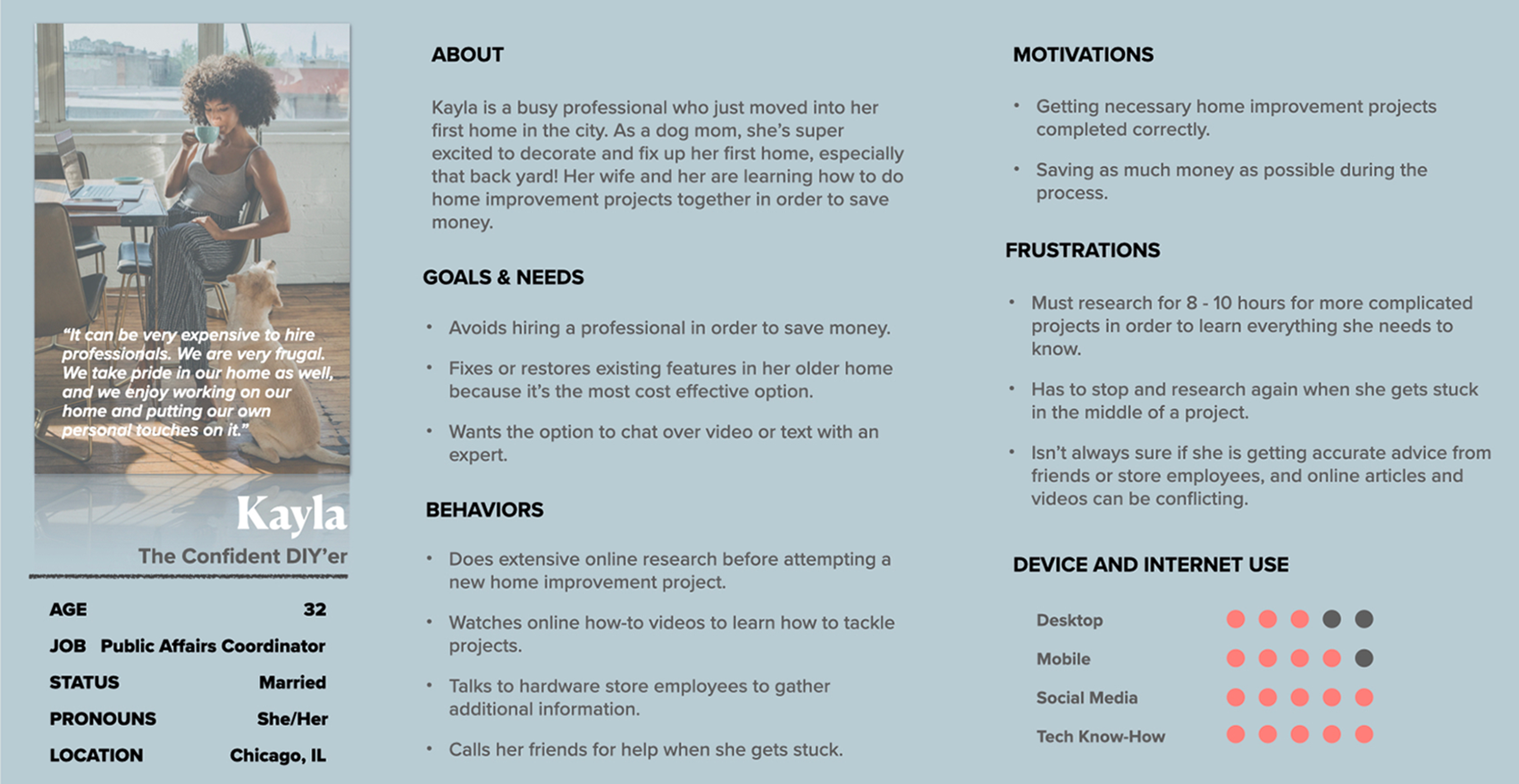
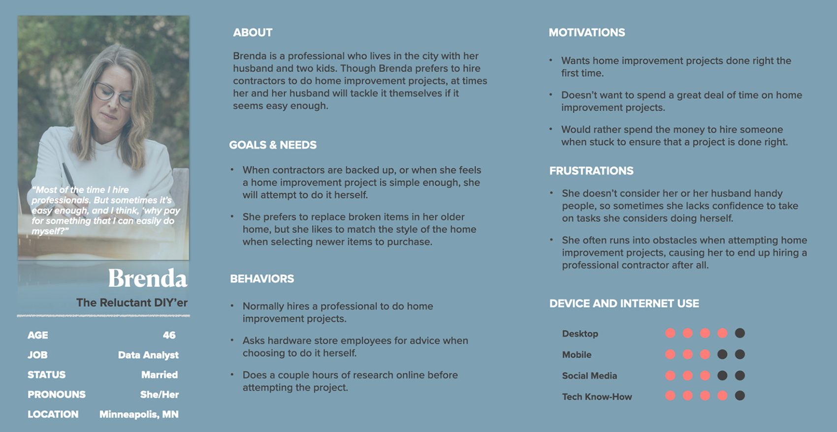
Production Note: By identifying distinct user motivations—from the DIY enthusiast to the professional-seeker—I was able to architect a more flexible navigation system and tiered subscription model.
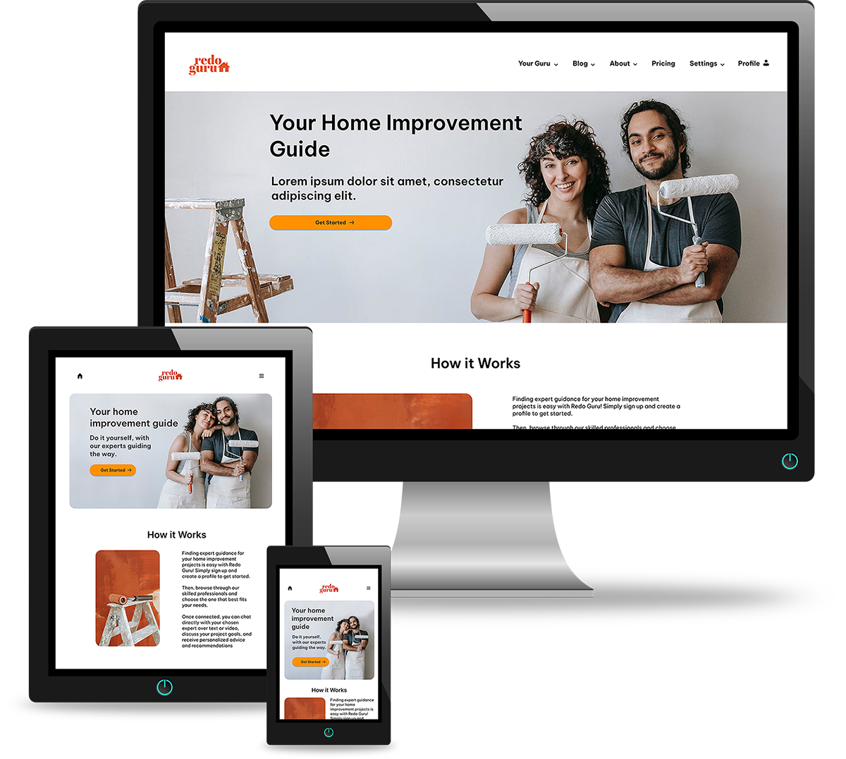
I translated validated user flows into high-fidelity mockups, focusing on clear calls to action, structured hierarchy, and intuitive navigation across browsing and payment modules. Each screen was designed with implementation feasibility and responsive behavior in mind.
Usability Validation: Conducted moderated testing with six participants to identify navigation friction, unclear hierarchy, and decision bottlenecks within key workflows.
Refinement & Iteration: Iterated on UI components based on testing insights to improve structural clarity, interaction flow, and overall visual integrity. Adjustments prioritized consistency, responsiveness, and production readiness across breakpoints.
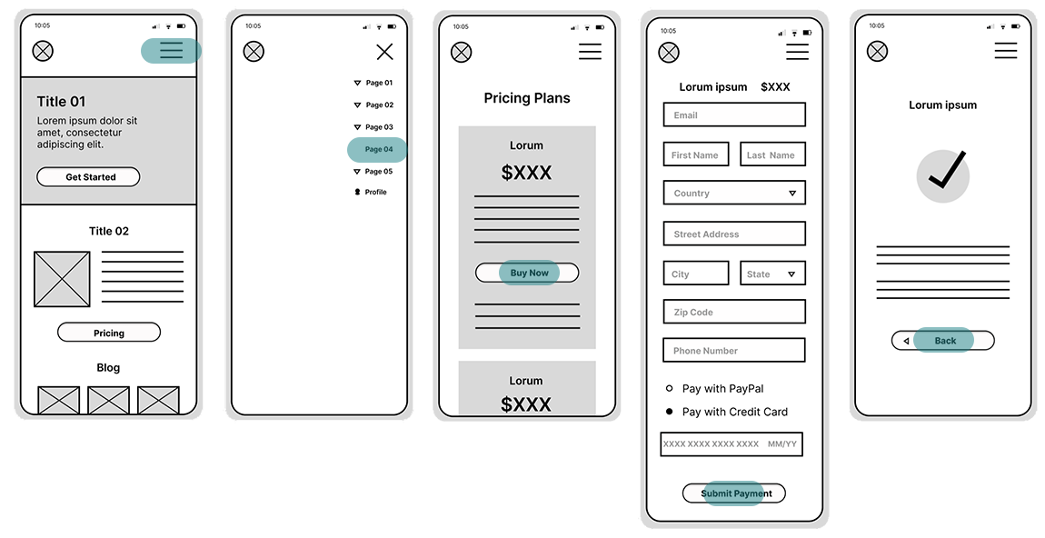
Before moving into high-fidelity production, I mapped core user flows through structured low-fidelity wireframes. This phase allowed for rapid validation of the Login, Discovery, and Payment modules before investing in visual refinement.
• Flow Logic: Established a clear structural hierarchy for browsing experts, managing subscriptions, and navigating payment tiers.
• Interaction Clarity: Prioritized intuitive navigation paths and adequate touch-target sizing to support responsive behavior across devices.
Login

Browse Experts
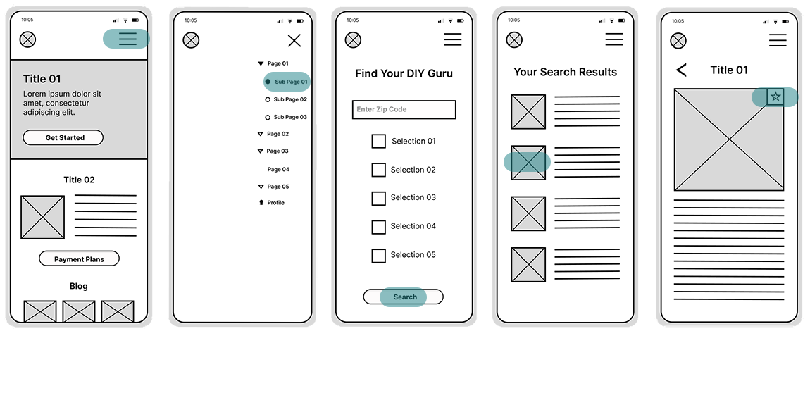
Collect Payment
To ensure the design met real-world performance standards, I conducted moderated usability testing with six participants across a wide demographic range (Ages 18-49).

• Objective: Evaluate learnability, navigation clarity, and friction points within browsing and checkout flows.
• Outcome: Identified key navigation errors and structural bottlenecks, leading to targeted revisions of the wireframes prior to high-fidelity production.
This validation-first approach ensured that visual refinement was built on a logically sound and user-tested foundation.
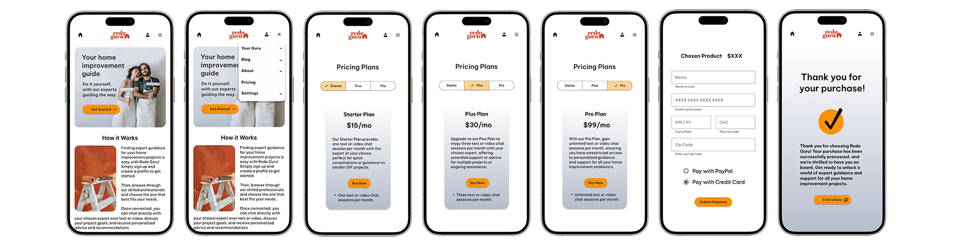
I translated validated wireframes into high-fidelity mockups, focusing on visual hierarchy, spacing systems, and brand-consistent typography. Each layout was designed with implementation feasibility and responsive behavior in mind.
• Refined component structure to ensure consistency across modules.
• Standardized spacing and layout rhythm using a defined grid system.
• Prepared interface patterns for scalable growth across mobile and desktop environments.
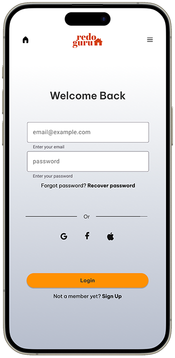
Login
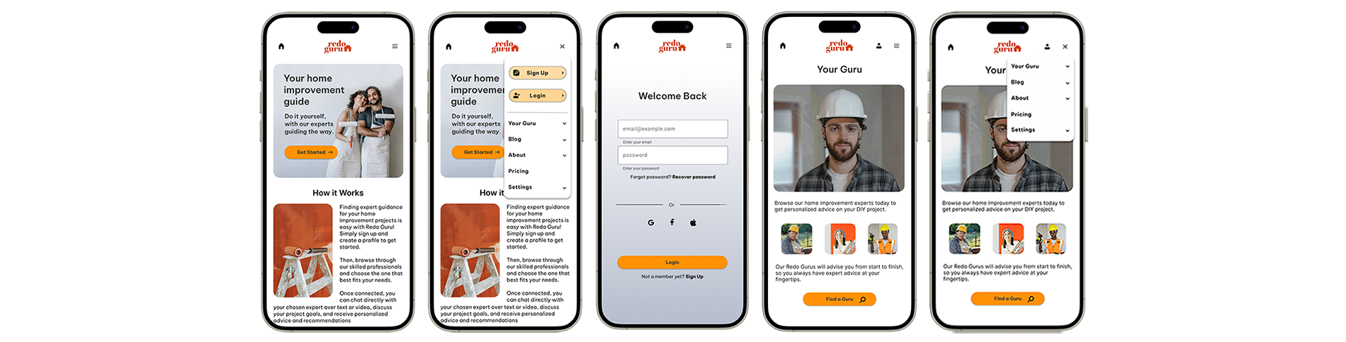
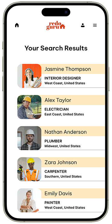
Browse Experts
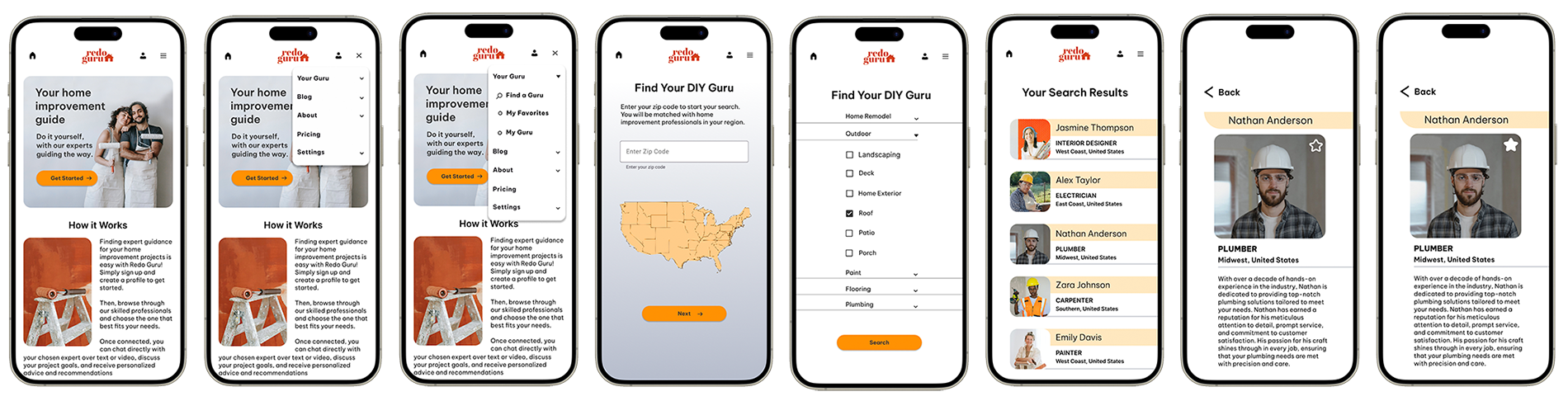
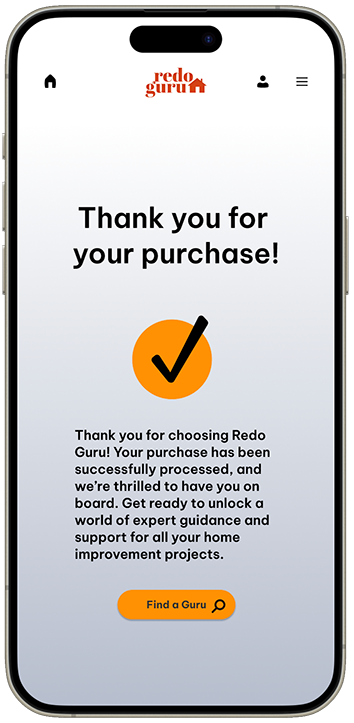
Collect Payment
Below are interactive prototypes developed in Figma to simulate real user flows. These demonstrate responsive transitions, structured navigation, and the overall cohesion of the validated interface system.
Login
Browse Experts
Collect Payment
Impact: The final architecture streamlines the journey from problem discovery to expert consultation, reducing research fatigue and clarifying next steps within a single structured interface.
Future Roadmap: Ongoing refinements include enhancing the mobile home layout and expanding the custom iconography system to further strengthen visual cohesion and scalability.

